
Lyndon Hood - student at the school of old
Wednesday, January 06, 2010
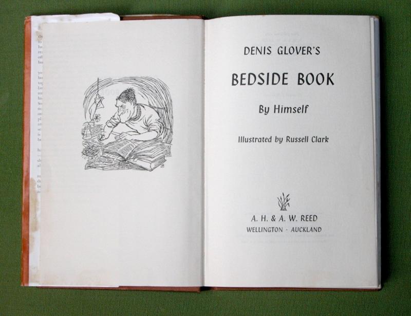
Click to enlarge
Left: Illustration by Russell Clark; Right: Klang.
Among the various things I picked up at the DCM Book Fair was Dennis Glover's Bedside Book. I have now got to it.
Pretty much my whole impression of Glover was that he wrote 'The Magpies', which was a good thing and which led to Gary Henderson's Skin Tight, which is another good thing.
I was surpised – I had almost certainly been told but I obviously wasn't' paying attention – at his position as founder of the semi-legendary (New Zealand) Caxton Press, printers of lovely books.
As it happens, the Bedside Book (1963, Illustrated by Russell Clark, contains work dating back to the thirties) comes from AH & AW Reed. But it contains a number of vignettes on publishing life under the title 'Herewith My Manuscript'. The first – also republished in Reed's The Kiwi Laughs – concerns getting a budding poetess out of the office as quickly as possible.
But there's also typography, and I aim to talk about that.
The essay 'Some Notes On Typography' isn't, in modern terms, all that remarkable for its sentiment. Unfairly short version: type, in books, is to be read. But it would be interesting for the general public, especially since we are talking about Olden Times, before everyone had a dozen famous typefaces within arm's reach. Consider that in 1977 The Guardian pulled off an April Fool's hoax celebrating the island nation of San Serriffe, in a seven-page suppliment riddled with typographical terms.
There is some meta-jollies to be had from Glover's piece. The paragraph after the paragraph on setting up paragraphs (which "ideally, should end with not less than half a line", ends in less than half a line; the next-but one paragraph after that ends in half a hyphenated word.
Such events do occur elswhere in the book and one should be cautious about throwing stones. I myself have turned off curly-quote auto-correction because I deal in so much code.
Nonetheless: It took me till I got to the end to notice that each of the three page-turnings have a word hypenated across them. Two of those leave the first line of the paragraph widowed at the bottom of the page and in those two cases the interrupted words are 'typographers' and 'typographer' respectively. So I'm calling it deliberate.
Having noticed this, I laughed and laughed.
A first poem, 'The Author on His Book' (titled with added note: But not this one) contains the couplet:
They've set it up, those tasteful men,
in Baskerville twelve point on ten.
Possible he means ten on twelve? Although that might be difficult for the rhyming unless his text was typeset by elves.
This actual book is, according to its small print, set in Baskerville eleven point, leaded one point (what I might call eleven over twelve) with headings in Klang.
This small print, however, does not mention one particular page with four different type families on it.
I, somewhat naughtily but at least not a good image quality, reproduce Dennis Glover's 'Some Type Faces at a Glance', as an out-print item of interest to design types and old-school printers, who I suspect are often on the lookout for sample texts.

Click to enlarge
Something else I've been meaning to blog on, found I think at Quilters Bookshop's Ghuznee St re-opening sale. I have already written about Whim Wham but there were a couple of things Verses By Whim Wham 1943 (Progressive Publishing Society, Wellington; printed by snap! Caxton Press) made me appreciate.

Click to enlarge
The first was his dry scepticism of various propoganda pieces coming over the wire from Europe. There a various pieces to the effect of, 'Oh, close friends of Mr Hilter report he is looking increasingly unwell, eh? I suspect you made that up.'
But the main one, having only read what amount to a best-of, is his consistency. There are 46 poems in the book which I assume makes it all or most of his weekly work. And it's all that good.
I hate having awesome heroes.
(Further to the compelteness thing: In the introduction Whim Wham's New Zealand Terry Sturm says Curnow never kept copies of his Whim Wham pieces and when he decided to republish had to advertise to see if anyone had kept them. I was trying to think of some lesson to draw from that and know I'm worrying whether I should have hard copies of my stuff. The actualy publications are probably as well archived as I could do digitally, but still.)
Labels: allen curnow, books, caxton press, dennis glover, humour, new zealand, satire, satirists, whim wham